
Nowadays, a website is often the first touchpoint a customer has with your company. Despite this, many companies still treat it merely as an online business card, forgetting that its main goal should be generating leads and sales. If a user encounters obstacles along the way, they get discouraged and leave the site, going to the competition.
It is the user’s experience, or UX (User Experience), that determines the success or failure of your online presence. Below we present the biggest and most common UX mistakes on company websites that you should absolutely avoid.
1. Lack of responsiveness (poor performance on mobile devices)
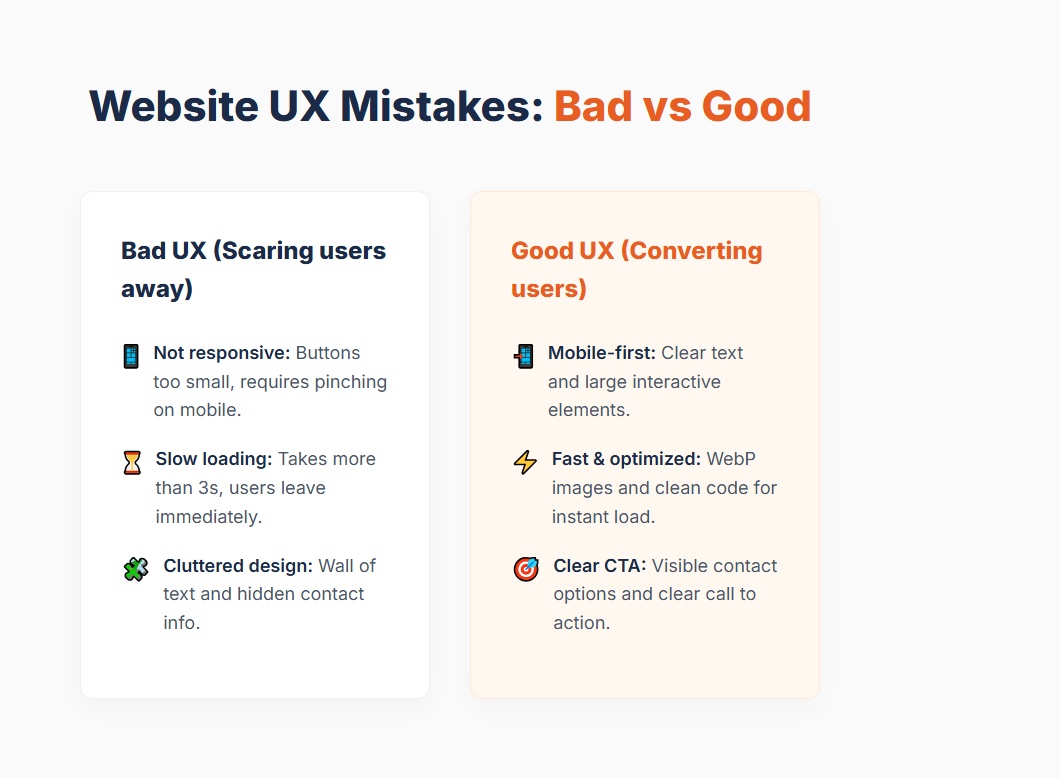
We live in a mobile-first era. Over half of internet traffic comes from smartphones. If your website does not scale properly to smaller screens, buttons are too small to tap with a finger, and text requires zooming (so-called “pinching” the screen) – you are losing customers right from the start. Bad mobile UX is also a huge minus in the eyes of Google, which negatively affects your positioning (SEO).
How to fix it?
Ensure a Responsive Web Design (RWD) approach. Interactive elements must be large enough, and text must be readable without zooming. It is crucial to test the website on real mobile devices, not just in a browser emulator.
2. Too long page load time
Internet users are impatient. If your page takes longer than 3 seconds to load, the bounce rate increases drastically. Users simply go back to the search results. Often, uncompressed, gigantic images, an excess of unnecessary scripts, or a weak hosting server are to blame.
How to fix it?
Optimize image sizes (use the WebP format), minify CSS and JavaScript files, consider implementing caching on the site, and make sure your hosting is efficient. Tools like Google PageSpeed Insights or GTmetrix will point out exactly what is slowing down your site.
3. Hidden contact details and no clear Call to Action (CTA)
A user enters your company’s website, is interested in the offer, and… doesn’t know what to do next. There is a lack of a clear Call to Action, such as “Call us”, “Send an inquiry”, or “Request a free quote”. It’s even worse when the user has to search the entire site looking for a phone number or an email address.
How to fix it?
Place the main CTA in a visible spot (preferably in the hero section at the very top of the page). Contact details should be easily accessible – in the footer and in a clear “Contact” tab in the main menu. Each subpage should have at least one clear call to action.
4. Content overload and complicated navigation (Wall of text)
Many companies want to tell everything about themselves right on the homepage. The result? A “wall of text” that nobody reads. Modern users do not read on the internet – they scan it. If a menu contains too many items and nested subcategories, the user gets lost and feels frustrated.
How to fix it?
Divide the text into short paragraphs. Use headings, bullet points, and bolding to make visual scanning easier. Simplify the navigation menu to a maximum of 5–7 most important elements. Remember: less is more.
5. Too many pop-ups
There is nothing more annoying than entering a site where the screen is immediately covered by a cookie consent banner, then a window asking to sign up for a newsletter, and finally a live chat pop-up with a loud notification. Such an information “attack” is a direct path to the user leaving the site instantly.
How to fix it?
Use pop-ups wisely. Set them so that they appear only after the user spends some time on the site, scrolls through a relevant piece of content, or shows an intention to leave (the so-called exit-intent pop-up). One pop-up at the right time does the job – five at once scares people away forever.
6. Inconsistent visual identity and amateur look
You only make a first impression once. If your company’s website looks like it was made “after hours” – using different fonts on each subpage, having inconsistent button colors, and stock photos clearly unrelated to the industry – the user immediately loses trust. On the internet, visual impression equals credibility.
How to fix it?
Invest in a cohesive visual identity system: one brand color palette, a maximum of two typefaces, and a uniform style of photography. Consistency in design builds professionalism. If your company values prestige, the website must reflect this in every pixel.
7. Lack of trust and social proof
Even the best-designed website won’t sell if the user doesn’t feel they can trust you. If the site lacks an “About Us” section with real photos of the team, testimonials from satisfied clients, or logos of business partners, in the eyes of the customer, you are an anonymous entity on the web.
How to fix it?
Show the human face of the company. Add a section with a short brand history and photos of employees. Collect and present client reviews with a visible first and last name (preferably linked to a Google Business profile). Case studies and portfolios are the best proof that you know what you are doing.
Summary
Each of the above UX mistakes is a leak in your “sales funnel” through which potential customers escape. An audit of the website for user experience is not a whim, but a necessity in today’s business. Often minor changes – from making contact easier to improving performance on mobile devices – can drastically increase the number of inquiries and sales from your site. Review your website from the customer’s perspective today and start sealing that funnel!